Running to the Edge
Autor(en):

I enjoyed a lot to present "Running to the Edge" at the PhotoBookFestival in Vienna. Instead of writing about the book myself i asked Julia Borissova to answer some questions and talk a bit about her book:
What stirred your interest in photography?
I was 20 years old when I started taking pictures and I shot a lot simply because I liked the process. But my creativity began to develop only in the last 5 years, from that moment when I started to ask myself: «Why do I shoot? Why do I shoot so much? What do I want to say with my pictures? To whom do I address my work?» etc.
And the more questions there were, the more meaningful I approached the creative process. I learned to find my own way in the photographic space through the assigned tasks. And if at first my interests were limited to and by documentary photography, now I am more interested in the conceptual side of my work.
Through photography I can express what I feel and what I am concerned about. It is a visual representation of my thought. Photography for me is a medium to explore and to reflect, to search a gap between the past and the future.
The “gap between the past and the future”, that's something that is also very visible in your earlier book “The Farther Shore”. Is there a specific reason that makes you interested in the power of photography to talk about that?
To understand the present better sometimes you should consider about the past. I think that the answers to all these questions can be found there. And I think I'm exactly in this interval, in the gap between the past and future. I feel it and try to reflect it in my work.
What is the reason for working not only with your own
photographs but also using "found" ones?
Found images can be always a source of my inspiration. Sometimes they are essential for a more complete artistic expression. The main thing in my artistic practice is to create the image, whether I use my own photos or appropriate pictures.
Where did you get the photos for “Running to the Edge” from? What is their connection to the Russian Revolution?
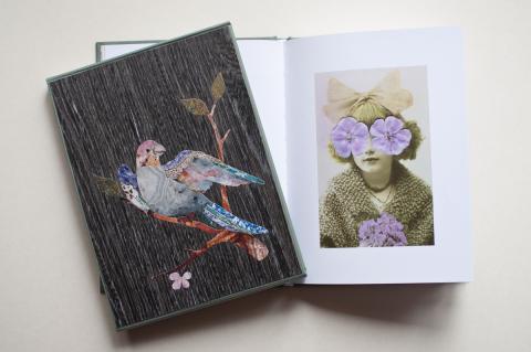
I bought all the photos that I used while working on this book at a flea market or antique shop. In "Running to the Edge" the archival images are the material for me with which I created an atmosphere of general and indefinite mourning for people unknown to me. I used a number of documentary signs to achieve the symbolic effect.
Some of the pictures in the book seem to be “sweet” like almost showing elves or angels. But others show the extinction of humans, dealing quite openly with death, at least in my opinion. Death and decay also come to mind through the often withering petals. I wondered that a lot of people at the photobookfestival in Vienna seemed only to see the “sweet” side. Some ideas of you concerning the theme of vanishing and death in the pictures?
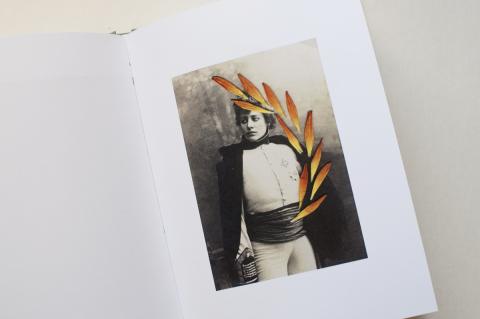
Working on this series, I realized that it may be accused of decoration. But for me each of these images is more than just a surface covered with flowers. I imagine the story behind each of these pictures and each of them gives me some empathy. Knowing for sure that all these people are dead, I create a kind of epitaph for them, and at the same time I return to them the possibility to live in our memory, emphasizing the present with bright colour petals that seem to have just been ripped off. The flowers play a dual role here - on the one hand a strong symbol of “vanitas” and on the other hand they create a connection between these old images with the present.
Could you say something about the handwritten texts you have chosen to show in the book? Those are excerpts from a diary? Written by different persons?
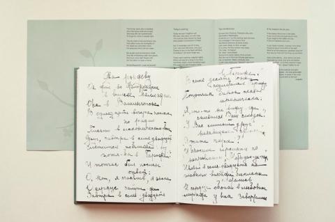
The second part of the book (the text) is a diary of 1917-20's. I bought it in an antique shop in St. Petersburg. I realized that this diary gives me a chance to show another layer of time to which I refer in my project. I show it not like a text, as additional information, but rather through the beauty of handwritten lines, through the sense of touch of the different hands that wrote these letters almost 100 years ago.
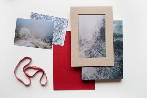
Could you say something about the way you designed the book ?
According to my plan this book should be like a found artifact, maybe like a diary belonging to an unknown author. I chose a small size for it, evocative of a school notebook and a discreet color for the cover. The title on the front page was made by hand, the way I would sign my personal diary if I had one.
When choosing the material for the book it was obvious for me that the images and text from the diary couldn't be printed on the same paper. For me it was important that the photos themselves are not stored and left in an archive. Using collage technique and overlaying flowers on them, I return the images of these people to our time. So I chose the paper with a high percentage of white and a silky surface. I wanted to make the images bright and the flowers seem to lie on the surface of the photo. For the second part I chose a paper with a rough surface, that would make the transition to the second part of the book palpable on the tactile level. The color is also different from the first part, but not in a bright contrast. And I ended up with the milky white paper with 100% cotton content.
In order not to distort the impression of the book as a found object, I decided to make a translation of the Russian texts in English, placing it on a separate insert. I wanted the color of the paper for the insert to be in contrast with the main book block but at the same time it should be understood that it is an integral part of the book. So I chose the designer paper matching the color of the cover. In the book there are also two pages of tracing paper, they accentuate the beginning of the first and second parts.
For a special edition, I made a case similar to a wooden box that would hold some relics. Inspired by the found diary (which has a wooden cover) and antique furniture from the Hermitage in St. Petersburg I tried to imitate the Florentine mosaic, making photos of certain stones and using them for applications on a wooden surface, trying to bring this work similar to inlay.
From the very beginning I already had a clear vision in my mind, but there were some nuances that I realized only later. While working on the book I had the wonderful opportunity to talk with Lise Sarfati, who gave me some useful tips. She suggested to me what I should pay attention to. Also the director of the St. Petersburg FotoDepartament Nadya Sheremetova supported me in my work. And, of course, my husband, he's my first adviser and helps me with everything.
What are your experiences with selfpublishing your books?
This is the second book that I self published and I can't say that it is easy to do, although I have some experience in working with printers. As a designer I knew about many points in advance that you need to consider and to think over at the initial stage. I know that when you create a book there are many small things that can't be ignored, everything is important. In fact, I can talk about it for hours, because the work on the book is really an exciting process and I love doing it. As an independent author I cannot limit myself to the selection of materials and I can come up with some creative solutions in design. I also love to do many things with my own hands.
You want to tell something about your next projects?
Right now I'm preparing a layout for my next book, which includes photos of the project "DOM". I created a very complicated design and now I have to decide how it is possible to print it. I know about the difficulties I’ll face. But I am seriously concerned about the result which has to be realized at the highest level.
© für alle Bilder/for all pictures: Julia Borissova
Fakten:
Julia Borissova: "Running to the Edge", St. Petersburg 2014
selfpublished
58 Seiten mit 28 farbigen Abbildungen + 24 Seiten mit reproduzierten Textseiten + 1 Einlageblatt und 1 Booklet mit Übersetzungen, 21 cm x 16 cm, Hardcover mit Prägung,
Auflage von 100 signierten und nummerierten Exemplaren
außerdem erhältlich als Sonderedition in einer Auflage von 20 Exemplaren im handgefertigten Schuber
Website der Fotografin (link is external) mit Informationen zu ihren Büchern und weiteren Projekten
Submitted by Hermann Lohss on 4. August 2014 - 9:07
